Etch A Logo Into Your Acrylic Pen Stand

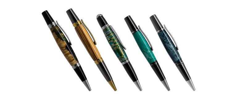
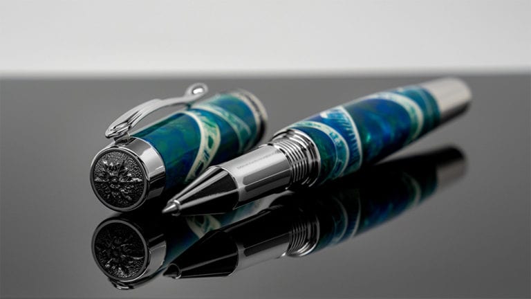
The Bowman Distillery is a few hours away from my house and I wanted to make some cigar pens using their whiskey wood so I decided to pay them a visit. Once I finished the pen I got the idea to try to include their logo.
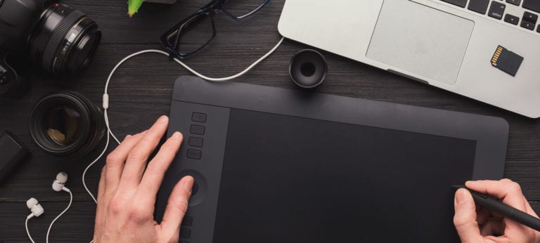
I found this 4-set of acrylic pen stands at Penn State and found them to be pretty useful when photographing pens. This post outlines a graphic design technique that’ll make the logo appear to be etched into the acrylic.
Step one
After opening this image in Photoshop, I added a Levels Adjustment layer just to set the black level which would boost the contrast to my liking.
If you follow the animation below:
- Add levels adjustment layer
- Select the black eyedropper tool
- Select the black in the image that you want to be the definition of black
You should notice a change in contrast.
 Animation
Step two
Import the logo. Size it and place it where you want it to be on the acrylic.
This technique works best if your logo is black or a dark gray so you may need to treat the logo before this step. Ideally, you have a vector version of the logo you want to use.
I found the A. Smith Bowman logo online in another image and cleaned it up for my purpose.
This is the view of the logo zoomed in with the white background removed. Size it and place it where you want it to appear on the acrylic.
Step three
This step is where you see the real magic. With the logo layer selected, add a Bevel & Emboss layer style. I should mention that the settings are not set in stone as they’ll vary depending on your logo file and the resolution of your image.
Add bevel & emboss layer style.
STRUCTURE Settings
- Style: Inner Bevel
- Technique: Chisel Soft
- Depth: Adjust the slider to taste
- Direction: See which looks best with your logo
- Size: Adjust the slider to taste
- Soften: Adjust the slider to taste
SHADING Settings
- Go ahead and adjust if you’re feeling froggy, otherwise leave as default.
 Animation
Pro Tip
When doing graphic design projects, it’s always best to start with the highest resolution image you have. This will output the best results and then you can resize the image for use on the internet later.
Step four
By default the logo may appear too bright so feel free to adjust the opacity to taste.
 Animation
Bonus step – Add my store logo
For my purposes, I wanted to add my own logo to the top of the image so I imported a vector version of my Paul Cress Signature logo.
Pro Tip
It’s really helpful to name the layers in your Photoshop (PSD) file. I can’t tell you how many times I’ve forgotten to name the layers and then returned to the PSD later only to wonder what the heck stuff was. Basically, it’s a huge time saver when you work on the file later or if you ever have to work with someone else on the same file.

Change logo color
For this particular image, I don’t like the way my logo looks in white so I’m going to add a Color Overlay Layer Style.
With the logo layer selected:
- Add Layer Style
- Select Color Overlay
- Be sure the Blend Mode is set to Normal
- Touch the color block to activate the eyedropper
- Using the eyedropper, touch a section of the image to ensure you have a matching color
 Animation
One last step
This is just a personal taste thing…
The mid tones were a bit dark for me so I added a Curves Adjustment Layer.
I want the adjustment to be made to all the layers below my Paul Cress Signature logo so with the layer beneath that selected:
- Add Curves Adjustment Layer
- Click into the middle of the curve
- Nudge the curve to your liking
- Adjust the opacity of the Adjustment Layer to your liking
 Animation
Final result